Demo 3): File IO and basic field manipulation
In this demo, you’ll learn how to import your own data, more plotting routines and how to postprocess data with the inherent functionality of the Field class.
Import:
[1]:
import empyre as emp
import os
import logging
logger = logging.getLogger()
logger.setLevel(logging.WARNING)
Loading data
You can use the io module (documentation will follow soon) to load a variety of different data formats. It uses the HyperSpy package (see here for more info) for a lot of the underlying work, but also has some routines for other formats as well. In general, all image files should work, as well as numpy data and others. The example here is the magnetic structure of a litographic Cobalt pattern. Note how we have to specify, that we want to load a vector field by
setting vector=True. For vector fields, we can also set, which axis should be interpreted as the component axis (default is comp_pos=-1 for the last axis).
[2]:
field_io = emp.io.load_field(os.path.join('files', 'magdata.hdf5'), vector=True, comp_pos=0)
print(field_io)
WARNING:hyperspy.api:The ipywidgets GUI elements are not available, probably because the hyperspy_gui_ipywidgets package is not installed.
WARNING:hyperspy.api:The traitsui GUI elements are not available, probably because the hyperspy_gui_traitsui package is not installed.
Field(dim=(1, 512, 512), scale=(2.3397676944732666, 2.3397676944732666, 2.3397676944732666), vector=True, ncomp=3)
Scaling data
Note how the loaded field is quite large (512 x 512 pixels). You can manipulate the size of your fields with the bin function, to bin over a certain number of pixels, or use zoom to interpolate to higher numbers of pixels. Here, we’ll do the former. Note how the scale automatically changes after binning.
[3]:
field = field_io.bin(3)
print(field)
Field(dim=(1, 171, 171), scale=(7.0193030834198, 7.0193030834198, 7.0193030834198), vector=True, ncomp=3)
Plot the loaded field
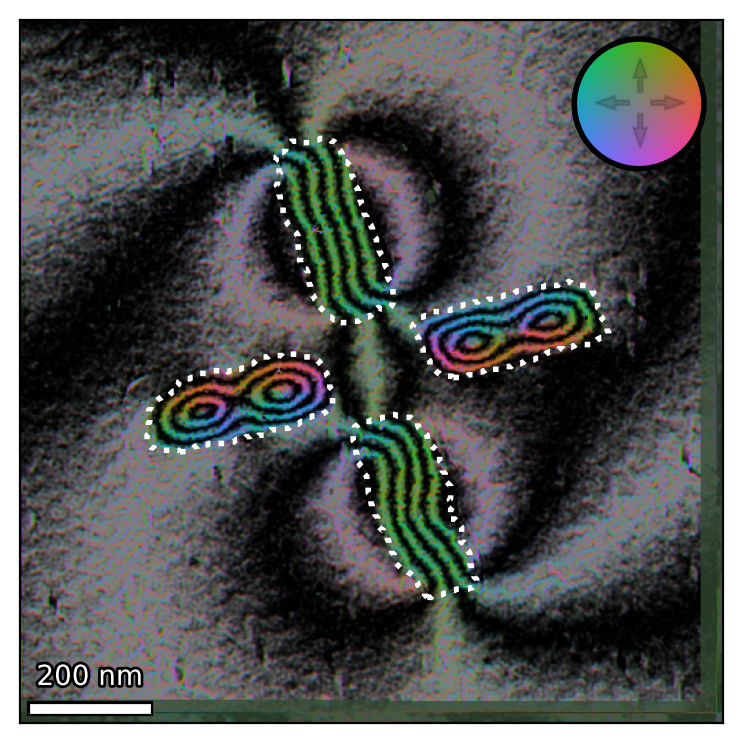
We now want to plot our loaded data. Note how the scalebar always tries to show “nice” numbers, even though the scale itself had long floating points. We are not content with the quiver plot though.
[4]:
emp.vis.colorvec(field)
emp.vis.quiver(field)
emp.vis.colorwheel()
emp.vis.scalebar()
[4]:
<mpl_toolkits.axes_grid1.anchored_artists.AnchoredSizeBar at 0x1753efd6048>
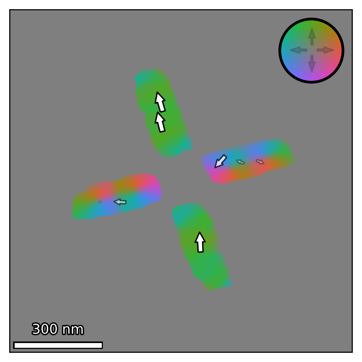
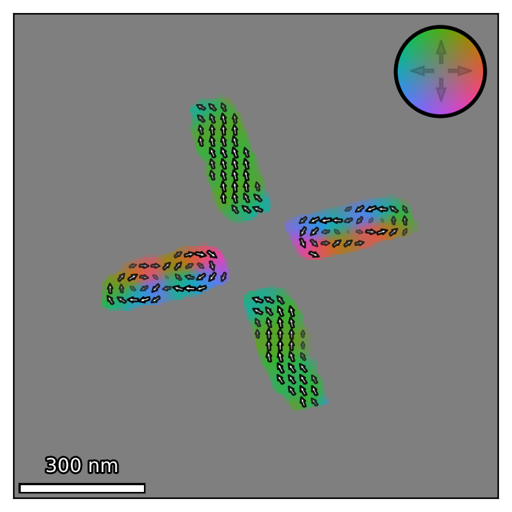
Nicer plot
The default binning size of quiver is determined in a way that tries to show 16 arrows across the whole field of view. In this case, we want to tweak this number to show more, but smaller arrows, which can be done with the n_bin parameter.
[5]:
emp.vis.colorvec(field)
emp.vis.quiver(field, n_bin=4)
emp.vis.colorwheel()
emp.vis.scalebar()
[5]:
<mpl_toolkits.axes_grid1.anchored_artists.AnchoredSizeBar at 0x1753f0afd68>
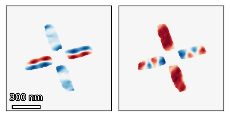
Split vector fields into its components as scalar fields
Furthermore, we can split our vector fields into its scalar components (also returned as fields), by accessing the comp attribute. We’ll also plot the in-plane components here.
[6]:
x_field, y_field, z_field = field.comp
print(x_field)
fig, axes = emp.vis.new(1, 2)
emp.vis.imshow(x_field, axis=axes[0])
emp.vis.scalebar(axis=axes[0])
emp.vis.imshow(y_field, axis=axes[1])
Field(dim=(1, 171, 171), scale=(7.0193030834198, 7.0193030834198, 7.0193030834198), vector=False)
c:\users\weber\documents\libertem\empyre\src\empyre\vis\plot2d.py:79: MatplotlibDeprecationWarning:
The DivergingNorm class was deprecated in Matplotlib 3.2 and will be removed two minor releases later. Use TwoSlopeNorm instead.
  kwargs.setdefault('norm', DivergingNorm(0))  # Diverging colormap should have zero at the symmetry point!
[6]:
<matplotlib.image.AxesImage at 0x1753f12ef98>
Merge scalars into vector fields
The opposite can be done as well, by using the class method from_scalar_fields of the Field class as an alternate constructor.
[7]:
field_recombined = emp.fields.Field.from_scalar_fields([x_field, y_field, z_field])
print(field_recombined)
Field(dim=(1, 171, 171), scale=(7.0193030834198, 7.0193030834198, 7.0193030834198), vector=True, ncomp=3)
Load more data and combine them
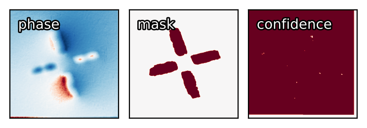
Let’s load more data from different formats, in this case the magnetic phase map that results from the magnetisation distribution from above, as well as a mask that determines the position of the litographic pattern and a “confidence” array that shows which regions of the (experimentally acquired) phase image we want to trust. Note that some loading routines need to be provided with the scale, otherwise they would be defaulting to 1, as not all formats are capable of saving the scale
correctly. All fiels are scalar fields and thus don’t need the vector parameter.
[8]:
field_phase = emp.io.load_field(os.path.join('files', 'phase.unf'))
field_mask = emp.io.load_field(os.path.join('files', 'mask.png'), scale=field_phase.scale)
field_conf = emp.io.load_field(os.path.join('files', 'confidence.npy'), scale=field_phase.scale)
# Plots
fig, axes = emp.vis.new(1, 3)
emp.vis.imshow(field_phase, axis=axes[0])
emp.vis.annotate('phase', axis=axes[0])
emp.vis.imshow(field_mask, axis=axes[1])
emp.vis.annotate('mask', axis=axes[1])
emp.vis.imshow(field_conf, axis=axes[2])
emp.vis.annotate('confidence', axis=axes[2])
c:\users\weber\documents\libertem\empyre\src\empyre\vis\plot2d.py:79: MatplotlibDeprecationWarning:
The DivergingNorm class was deprecated in Matplotlib 3.2 and will be removed two minor releases later. Use TwoSlopeNorm instead.
  kwargs.setdefault('norm', DivergingNorm(0))  # Diverging colormap should have zero at the symmetry point!
[8]:
<matplotlib.offsetbox.AnchoredOffsetbox at 0x1753f1a7e10>
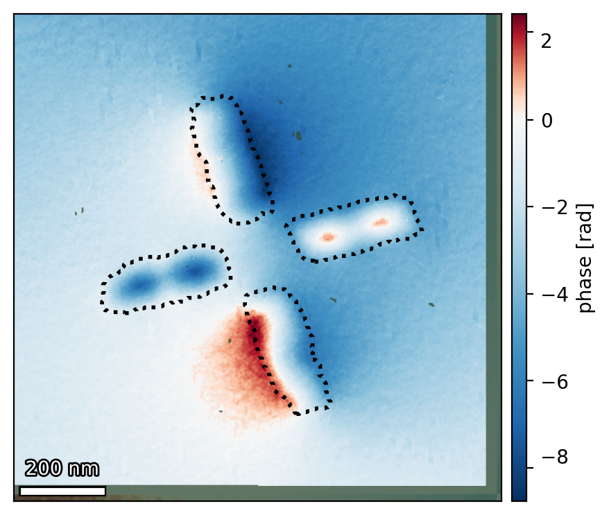
Combined plot
We now want to plot all the loaded information into the same image. * We plot the phase with imshow, just like before. * We plot the mask as a contour plot. * We plot the confidence as another imshow, but with a special colormap. * We add a colorbar that needs the phase image as an input to work. * We add a scalebar.
[9]:
im = emp.vis.imshow(field_phase)
emp.vis.contour(field_mask)
emp.vis.imshow(field_conf, cmap=emp.vis.colors.cmaps.transparent_confidence)
emp.vis.colorbar(im, label='phase [rad]')
emp.vis.scalebar()
c:\users\weber\documents\libertem\empyre\src\empyre\vis\plot2d.py:79: MatplotlibDeprecationWarning:
The DivergingNorm class was deprecated in Matplotlib 3.2 and will be removed two minor releases later. Use TwoSlopeNorm instead.
  kwargs.setdefault('norm', DivergingNorm(0))  # Diverging colormap should have zero at the symmetry point!
[9]:
<mpl_toolkits.axes_grid1.anchored_artists.AnchoredSizeBar at 0x1753fd511d0>
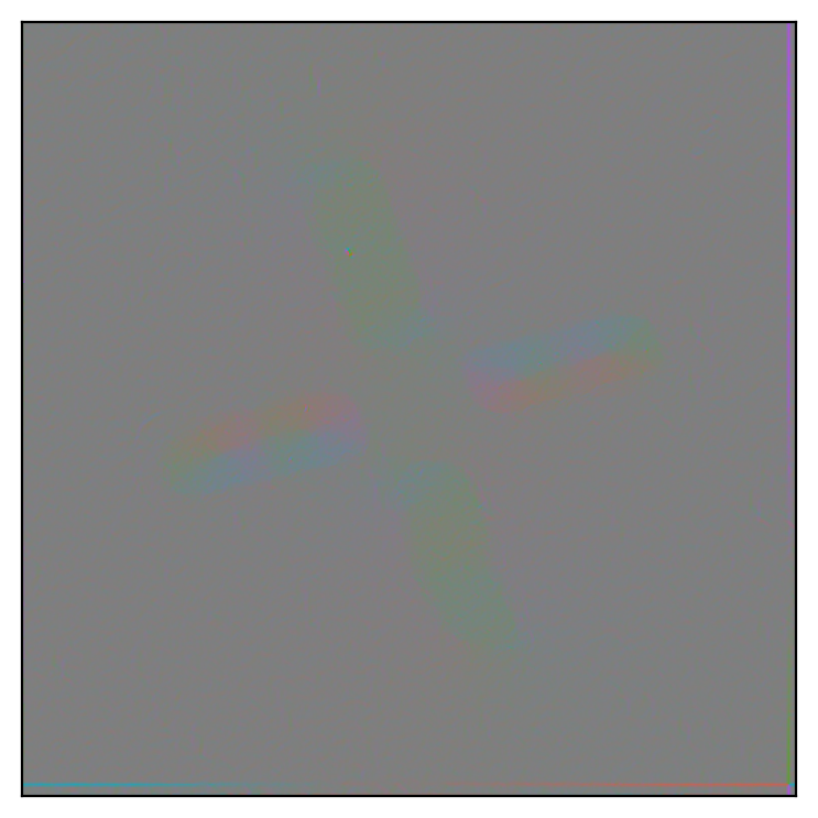
Holographic contour plots
Magnetic phase images are often shown as holographic contour maps, which you get by calculating the curl (or rotation) of the magnetic phase and overlay it with cosine contours (the cosine of the phase, amplified by a gain factor). Due to empyre being rooted in the analysis of magnetic phase images, the according functionality is here as well. First, let’s create the rotation of the phase image by using the curl function. Visualizing it with colorvec shows a problem, though. The
strongest saturation is fixed to obviously erroneous pixels and the interesting parts of the image seem faded out and unsaturated.
[10]:
emp.vis.colorvec(field_phase.curl())
[10]:
<matplotlib.image.AxesImage at 0x1753fdc0cc0>
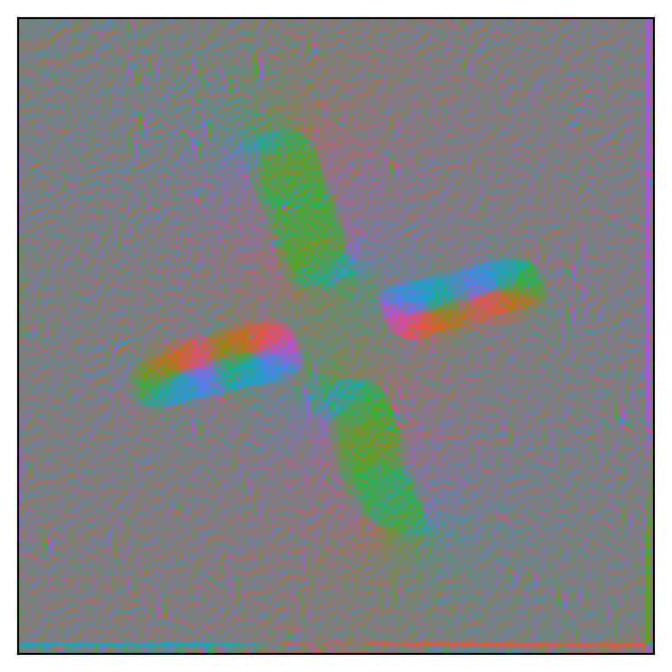
The curl and clipping
We can use the clip function to clip the values to all lie in a Gaussian distribution with a certain sigma (the usual numpy functionality with specifying vmin and vmax is available as well). This clips noisy regions where the rotation is very strong due to sharp boundaries or noise.
[11]:
emp.vis.colorvec(field_phase.curl().clip(sigma=2))
[11]:
<matplotlib.image.AxesImage at 0x1753fe13fd0>
Cosine contours
Next we look at the cosine contours of the phase, which we can plot via the cosine_contours plot function in vis. Not that normally, a gain factor is determined automatically (default: gain='auto'), but we’ll look at the pure, unaltered cosine here first.
[12]:
emp.vis.cosine_contours(field_phase, gain=1)
[12]:
<matplotlib.image.AxesImage at 0x1753ff88f98>
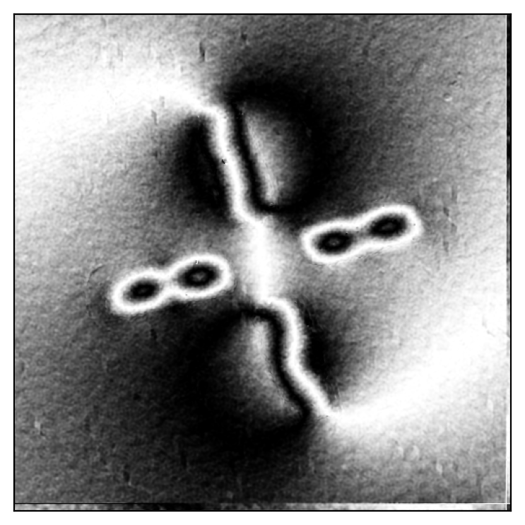
The full contour map
Now let’s combine both plots, add confidence and mask plots again, as well as a colorwheel and a scalebar. The cosine contour now searches for an adequate gain automatically. Also try out other colormaps (e.g. the cyclic_classic one that corresponds to many holographic contour plots in older publications)
[13]:
cmap = emp.vis.colors.cmaps.cyclic_cubehelix
emp.vis.colorvec(field_phase.curl().clip(sigma=2), cmap=cmap)
emp.vis.cosine_contours(field_phase)
emp.vis.contour(field_mask, colors='w')
emp.vis.imshow(field_conf, cmap=emp.vis.colors.cmaps.transparent_confidence)
emp.vis.colorwheel(cmap=cmap)
emp.vis.scalebar()
[13]:
<mpl_toolkits.axes_grid1.anchored_artists.AnchoredSizeBar at 0x1754012cb70>